


As creatives, we are constantly testing out new ideas, styles, and designs in everything we do. We are always on the lookout for exciting, new design trends that we can incorporate into projects for our clients. We’ve seen quite a few design themes circulating lately – here are some of our favorites:
Memphis style design
2D + 3D motion
Anti-design
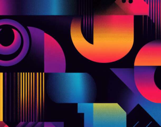
Back to the 90’s
Mixed match type
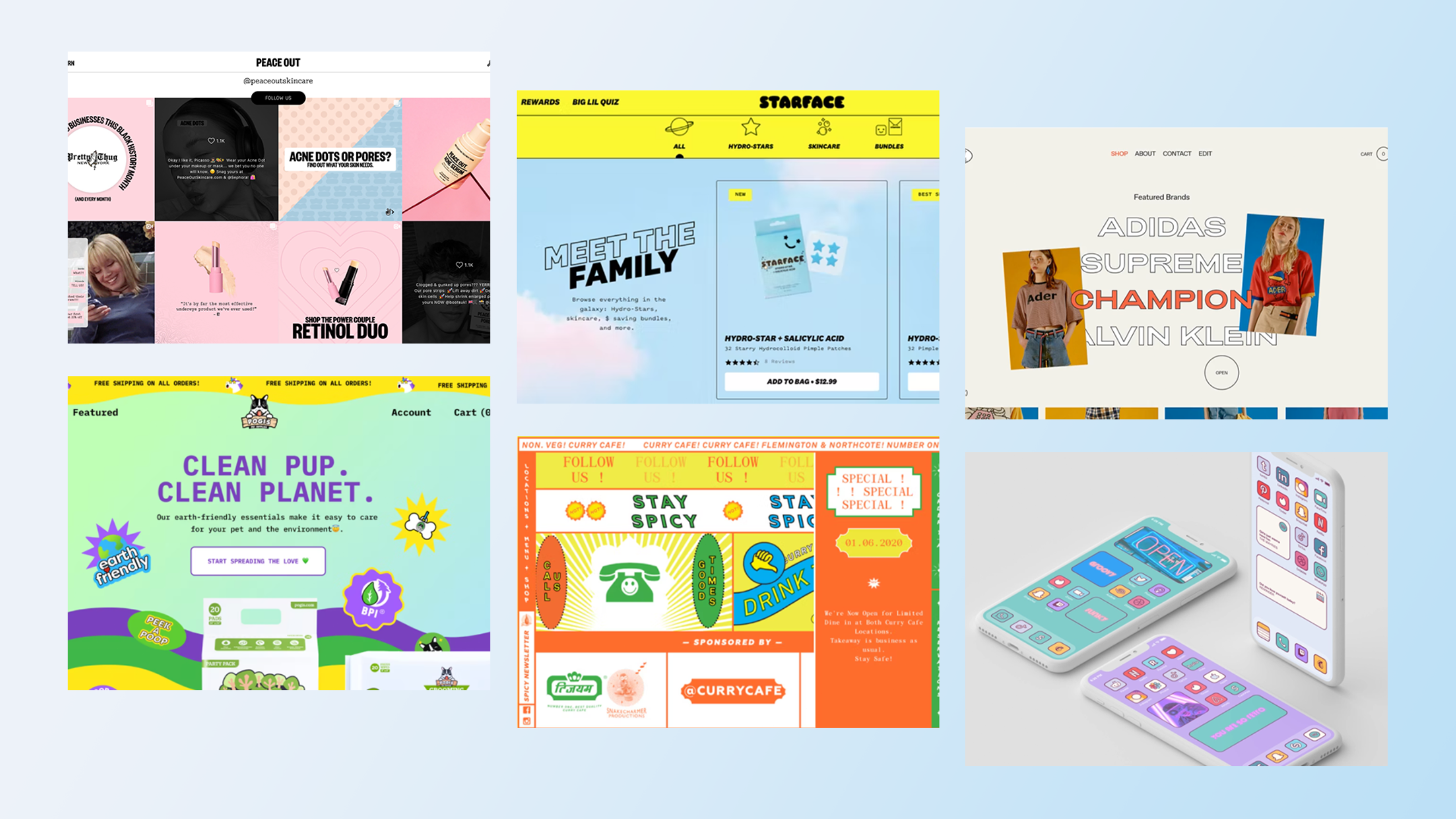
Memphis style design
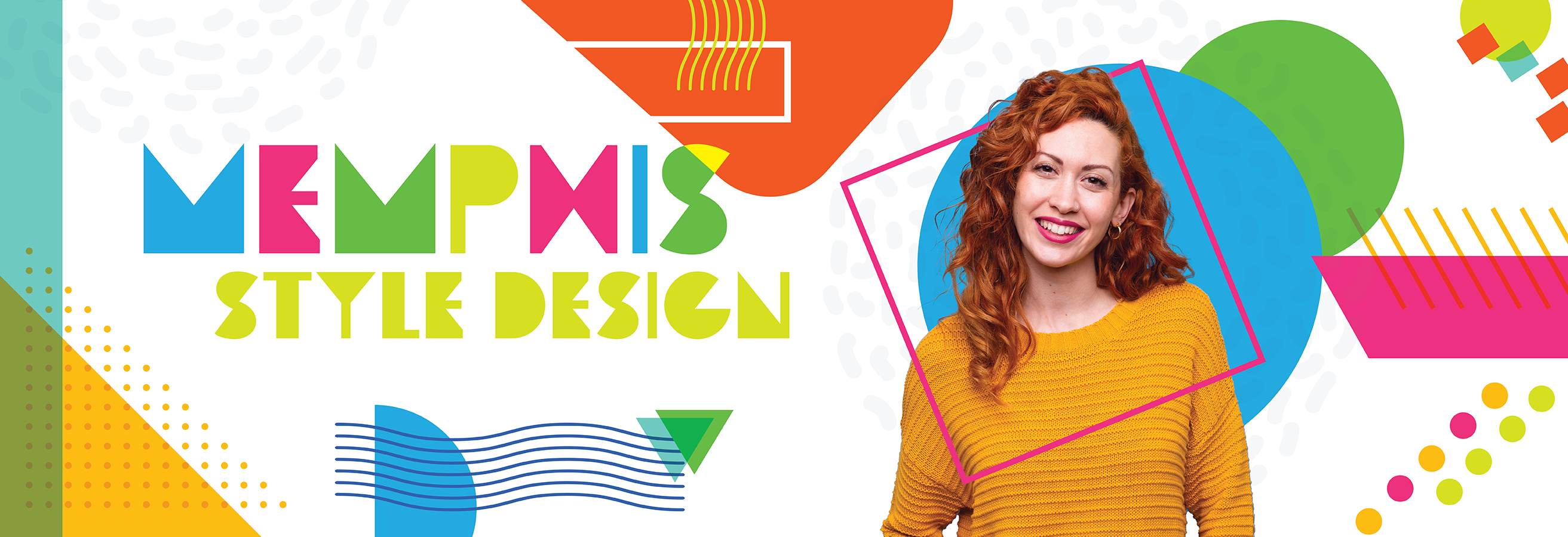
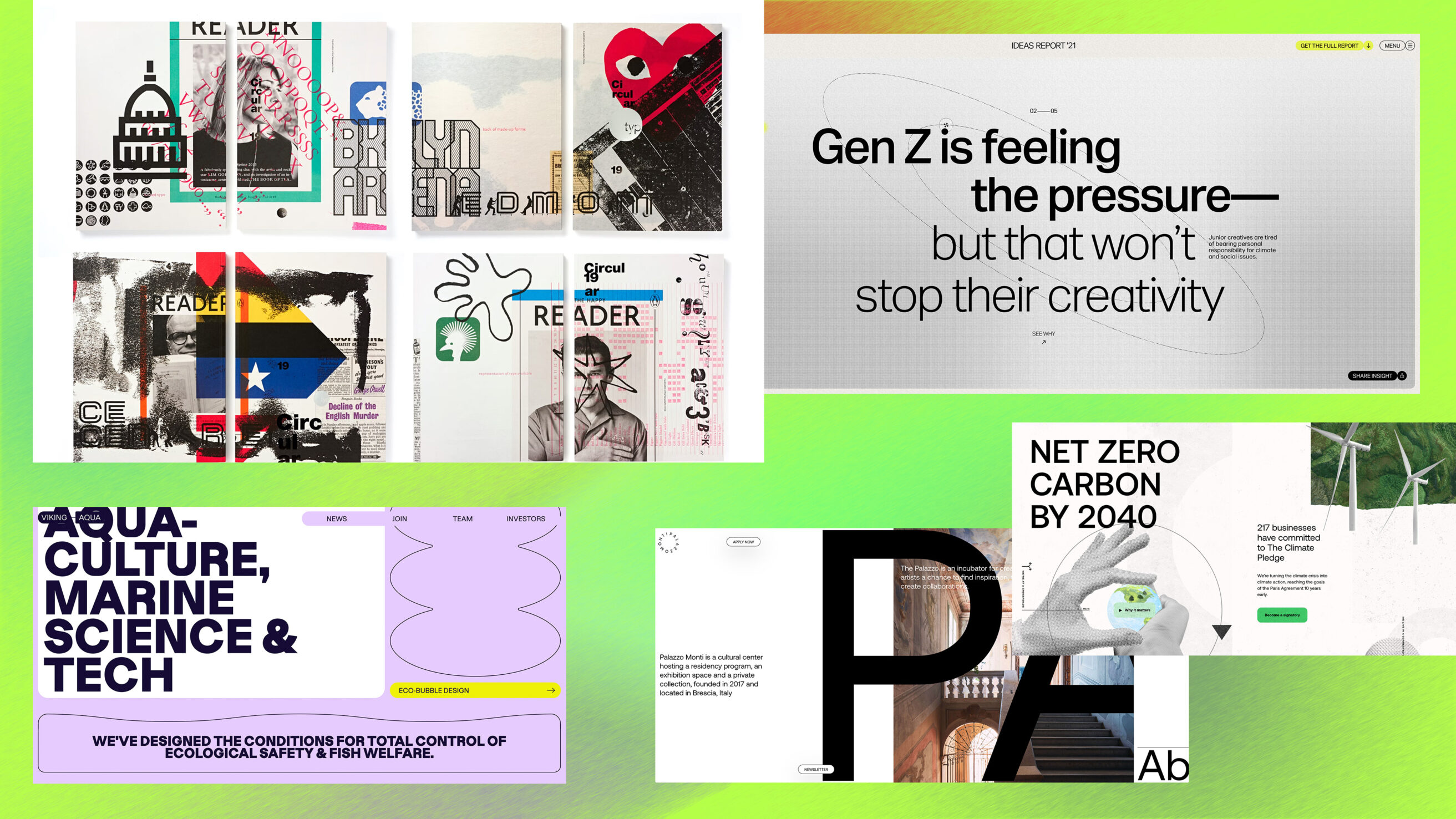
The Imarc team has seen more Memphis style design reemerging in website design. Memphis style is a mix of art deco and 1980s pop art. Its emergence is all about nostalgia and utilizing fun, somewhat chaotic, dotted, bold patterns, and geometric shapes.
The style is a very alluring design technique because it allows freedom, boldness, and energy with its vibrant color palette. Its fearless, amorphous shapes and geometric figures allow designers to create showstopping elements for brands, web designs, and products. The style can be utilized across a wide range of design techniques, and we look forward to seeing more of it in the coming year.
The color palette varies, but we’re leaning toward neon tones for 2022. This style pairs nicely with the nostalgia of the 90’s revival happening. We all need a touch of freedom and nostalgia, and this design projection allows for that outlet.
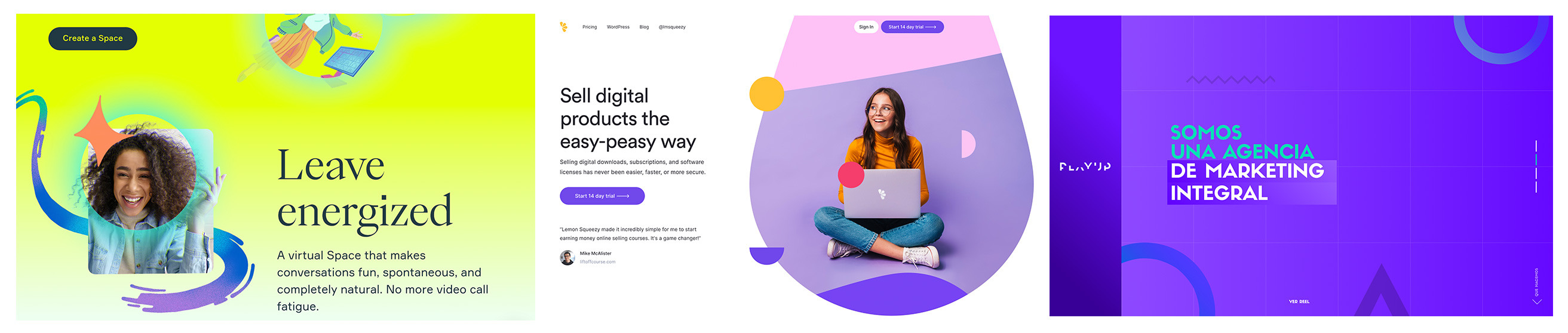
2D and 3D motion
More designers are turning to 3D isometric design to advance their mockups, ads, social media posts, and even websites. Recently, there has been some exploration into adding 2D designs into the 3D layouts. This combines the grounded 2D designs we know and love with the 3D depth. Many newer websites are using this combo to showcase their products in a more interactive and unique way.
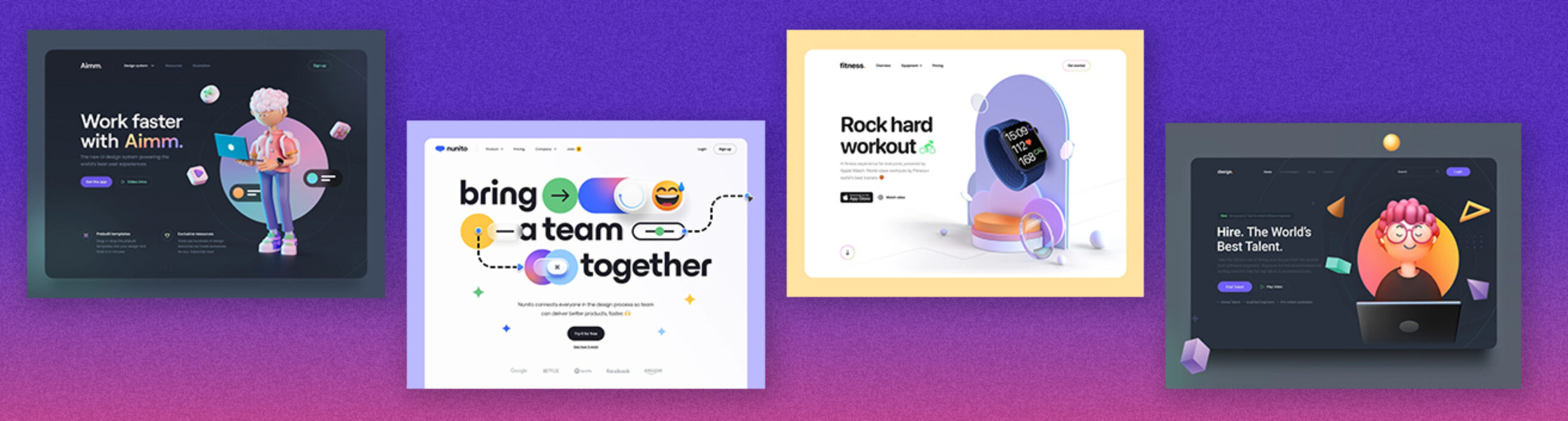
Motion is often used in combination with 2D and 3D elements to show off products or help create movement throughout website pages. We have seen a lot of interest in animations for interactive elements of the pages. Our creative team is looking forward to incorporating more 3D + 2D and motion elements into our designs.
Anti-design
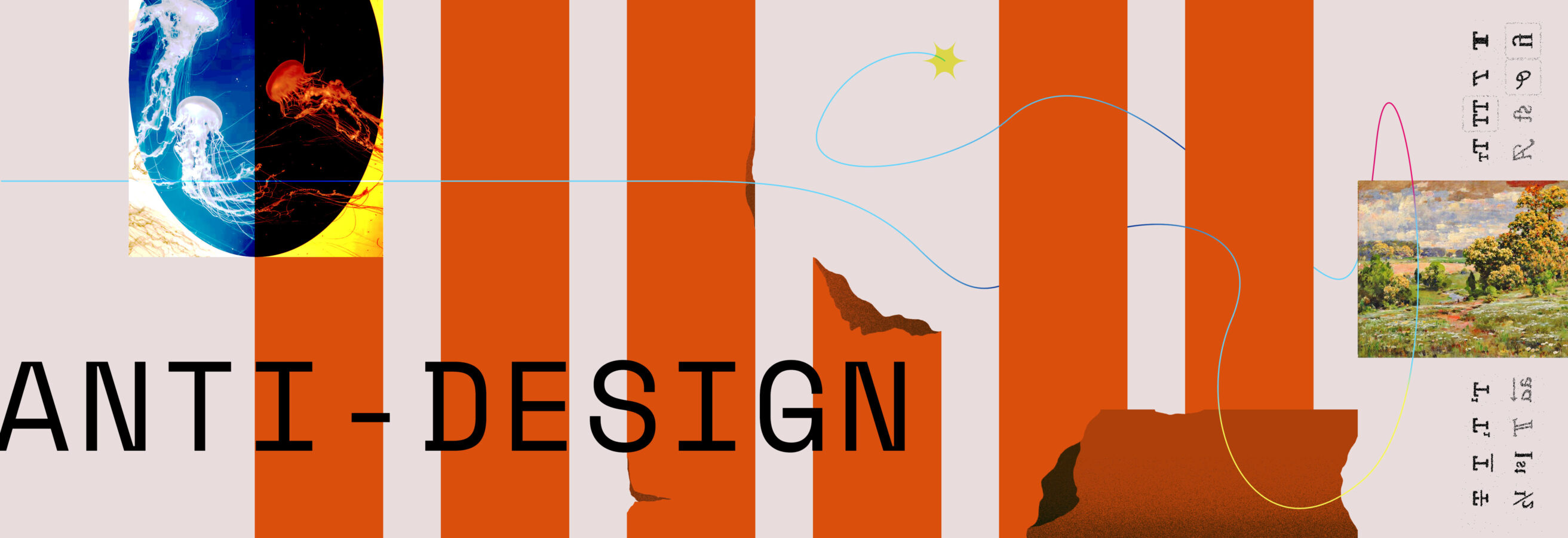
How can the words “anti-design” appear on a design trend blog post? It might feel counterintuitive until you consider the modern-day applications. Anti-design is about casting off traditional design fundamentals: symmetry, hierarchy, cleanliness, and predictability. Anti-design intentionally ignores these concepts in favor of a more realistic and often chaotic style.
This design movement has been around for decades. It started as a counter to minimalism and over-simplified designs, which made designers feel restricted. In recent years, we’ve seen a big push towards more human and authentic imagery. It makes sense that we’d crave some variety that acknowledges vibrance, necessity, comfortable disorder, and truly unique visuals! Seeing unfamiliar and imperfect works can be very relatable.
Use this style wisely and in the right places. Anti-design can signal a certain level of quiet confidence and a willingness to be bold. Bordering on art, anti-design graphics can make a rebellious statement that forces people to focus on their own feelings and imperfections in the hopes of creating an honest and authentic connection.
Back to the 90s

While dial-up internet may seem like just yesterday for some, the 1990s are having a retro comeback. The 90s conjure up nostalgia and simpler times. It’s also the decade that introduced the world wide web. Designers are craving a revolution after years of minimalism and refined designs. We want less rigid layouts, and we want to add fun lines, icons, and shapes.
Taking inspiration from Memphis design, 90s style is heavy on bright colors. You’ll notice this style is especially popular with Gen Z and millennials. They love to celebrate past decades, and they take inspiration from them. We project you’ll be seeing more and more of this style with a heavy emphasis on nostalgia.
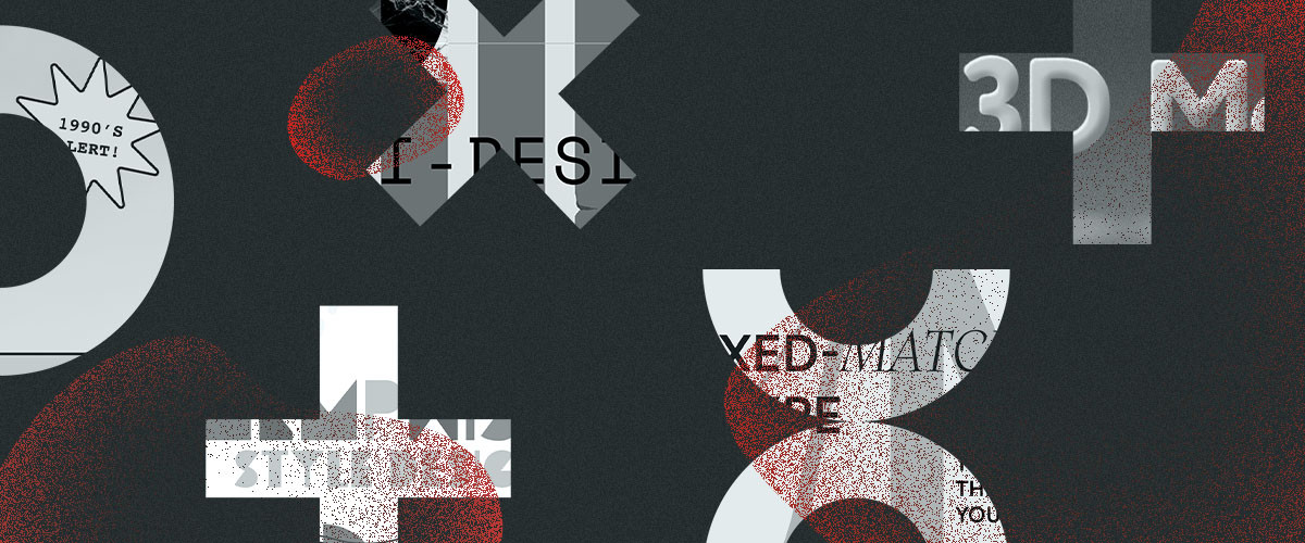
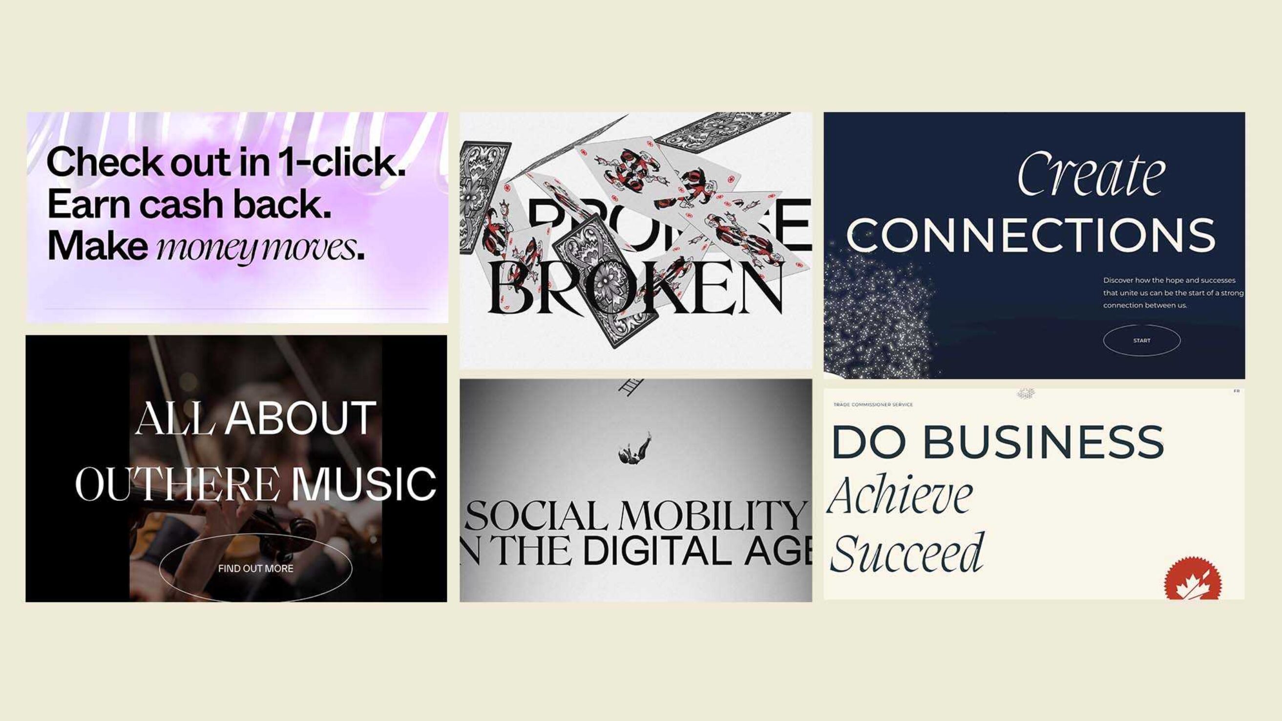
Mixed-matched type
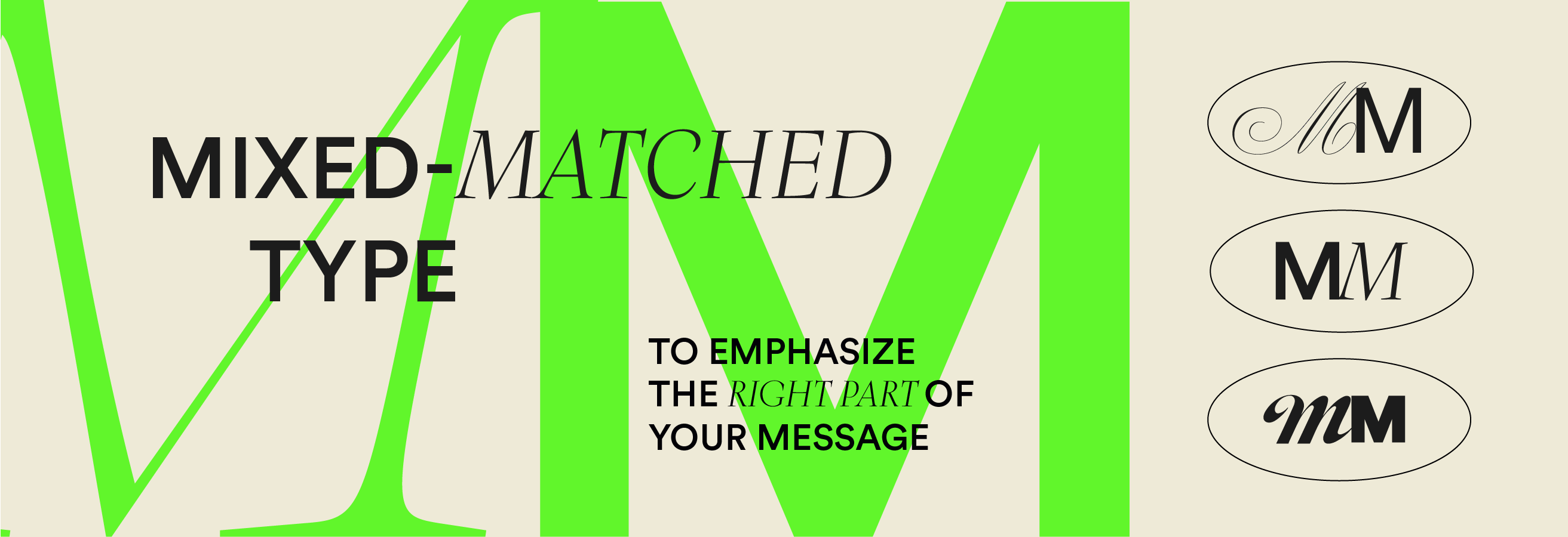
One thing is for sure: type is having a moment. And it’s going to continue to thrive in 2022. Brands are opting for bold, typographic headers with short, strong messages – often by pairing both serifs and sans serifs.
But don’t be fooled, the skill of successfully combining two different typefaces together isn’t an easy one. If possible, find a font family that has serif and sans serif siblings so the discrepancies are minimal and the result feels natural. We’re going for that “intentionally, unintentional” design aesthetic. Otherwise, start with a simple base font, and then allow the contrasting display font to emphasize the important part of your message.
What’s next?
You can count on us to be the first to know about new design trends. Does your website or brand need a little pick-me-up? We’re here to help! Let’s talk.
Sources
Dola | Atelier | The Future In Mind | Outhere Music | The Climate Pledge | Pentagram | Viking Aqua | Palazzo Monti | WeTransfer | PEACE OUT | Starface | Dribbble: Twice Nice Thrift Store | 99designs | Curry | Dribbble